The Network Monitoring Dashboard is critical for your users to process, interact with, and analyze data.
While most enterprise teams understand the essentiality of dashboards, they often fail to maintain the efficacy of a well-designed dashboard.
A common phenomenon among dashboards is that even the most sophisticated-looking dashboards, embedded with colorful graphics, can be deceptive and uninformative for the decision-making process.
With Monitoring & Evaluation (M&E) becoming a key part of project management, technology teams are increasingly dependent on dashboards to analyze, rectify, and augment their ongoing initiatives.
Dashboards allow key decision-makers to get insights and KPIs communicated in a visually accessible and organized format.
This way, IT ops teams can gain complete visibility into your IT performance at a glance.
By having a good monitoring dashboard in place, you help your team-members run more systematic operations that produce their aimed results.
The Dichotomy of an Effective Monitoring Dashboard
Core Metrics
Core metrics should be the top priority for your monitoring dashboard.
Pay special attention to filtering between the four golden signals and the RED method.
Four golden signals were suggested by Google Site Reliability Engineers and include acute measurement of latency, traffics, errors, and saturation.
RED method is more preferable for micro-services and includes a detailed gauging of rates, errors, and duration.
Latency
Latency is the measure of how fast are data packets travelling across your network. High latency would mean slower processing and this can result in network performance lags.
Your dashboard should reflect latency in percentiles while ensuring that no failed requests are included in the eventual assertion of the results.
Including the failed requests in the latency metrics can create skewed results and result in misallocation of resources.
Traffic
Traffic represents the number of users active on your network at any given point in time. Requests Per Second is a popular metric to measure the network traffic loads.
Evaluating this metric can help you get an accurate understanding of the resources necessary for supporting the traffic.
It can also serve as an input in the projection for network loads and highlight statistical anomalies in network traffic.
Errors: Set Alerts
Before calculating the errors, you will have to define what constitutes as an error in your network’s performance.
You can take statistical performance or your SLA as the primary directive for defining errors.
Generally, the metric is calculated around the rate of non-2XX status code responses.
Monitoring Threshold Limits
Threshold Limits represents the degree of overload in the network. Queued elements and busy threads are common methods of analyzing the saturation in a network.
Business Metrics
Business metrics are constituted by a group of customized metrics which are created in line with the core business performance goals such as product performance metrics, retention rates etc.
Hence, they are the result of a more top-down process and are separately reported for each service line.
The Foundation of Building an Effective Network Monitoring Dashboard
A typical dashboard can have several layers and segments spanning over visualizations, data processing, aggregation, widgets, and reporting.
With so many moving parts, building the right dashboard can appear more complex than it should be.
Here are the fundamental practices that can help you in building the right monitoring dashboard:
1. Define the Dashboard’s Purpose
Dashboards can fit into a wide range of use-cases. Thus, before you set out to design one, you should have a clear idea of the dashboard’s core purpose.
You should have answers to essential questions like what type of indicators the dashboard will monitor, use midline or baseline analysis, and what type of decision-making processes will flow through it.
You should also focus on whether the dashboard is being designed to track or filter a specific set of events or maximize data coverage.
All of this becomes critical because even though dashboards can serve a wide range of purposes, they have limited information display capabilities.
Hence, with judicious planning, you can prioritize how the information is processed and displayed.
2. Understand the Users
The users of your dashboard should be the primary target audience when you design and engineer the dashboard.
Depending on her/his scope of work, every individual, professional responsibilities, incentives, and decision-making frequency, will process the same set of data in different manners.
A manager may want more high-level trends while a customer may prefer more granular data-points.
Understanding the needs of the end-user can help you define the baseline features and design for your dashboard.
3. Prioritize information
While conducting your initial surveys, you would come across several data-points that seem ‘necessary’ for the dashboard.
However, when you perform an exploratory data analysis study, you will find the exact data-points critical for monitoring purposes.
This set of data-points makes the key message of your dashboard, and it should be one of the guiding-points for its design.
4. Use the 10-15 Rule
Dashboards that are overburdened with information are rendered useless.
You can use this principle to decide whether your dashboard is making the insights accessible or not – the user should be able to go through all the vital information easily within 10 to 15 seconds.
If the user takes more time than this ideal length, there is a high probability that the dashboard is cluttered with data and visualizations.
In such cases, you should focus on simplifying the visualizations or revisiting the scope of information covered.
Even when the dashboard has been handed over to the users, you should frequently check it for its performance on the ’10-15′ rule.
5. Establish the Context
Providing context with the dashboard can simplify analysis for the users and expedite the decision-making process.
For instance – instead of looking at the number of devices in the network, the user would be interested in knowing how the change in these numbers impacts the KPIs she/he is tracking.
The users would want to know much more than just numeric reporting.
They would be interested in knowing how well the network monitoring platform performs, deviation from mean performance levels, and historical performance.
Like comparable values and goal lines, some basic elements can aid the contextualization process and even enhance it.
In Conclusion
Demand for IT services and digital transformation is increasing nowadays.
IT ops teams have been struggling to monitor and deliver all the key performance metrics on time as they have dedicated a significant portion of their resources to perform manually intensive low-value tasks using multiple dashboards.
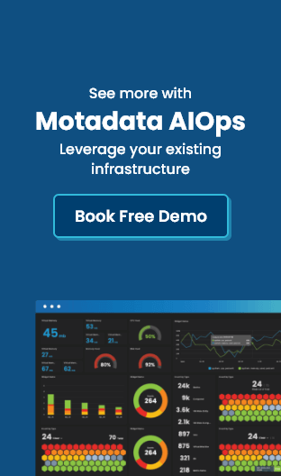
With Motadata’s built in open-AI architecture and a unified dashboard you can monitor all the layers of your IT infrastructure.
Motadata has been configured at its core with the best practices for dashboard design and engineering.
Network topology visualization in the platform allows you to monitor device-level performance.
The entire platform comes as a virtual appliance and works as a cost-effective solution. With its intelligent pattern recognition capabilities, you can gauge early trends of systemic issues.
Moreover, the network monitoring platform provides a correlation between events and adds the right context to the performance data.
The entire Motadata network monitoring platform has been designed for an in-depth analysis without compromising on insightfulness or accessibility.
That is why all the logs, flows, and metrics are available on one unified dashboard.
Whether you want a contextual trend analysis or want to drill-down to the granular details – you can do it all with the Motadata Network Monitoring dashboard.