RUM Metrics That Matter for User Experience and Revenue
Why does a page that scores well in testing still draw complaints from customers about slowness? A lab test runs on one fast machine over a stable connection. Customers use older phones, congested mobile networks and browsers loaded with extensions, so their experience can only be measured on their own devices.
Real user monitoring captures that experience, and it produces a long list of measurements. Load timings, interaction delays, layout shifts, error counts and click behavior all arrive on one dashboard. Without a way to sort them, it is hard to know which figure deserves attention first and which ones affect the business.
This guide builds on our overview of real user monitoring and focuses on the metrics themselves. In this blog, you will see which RUM metrics answer which question, the thresholds that separate good from poor, how to read percentiles, which metrics deserve an alert, which ones leadership should review, and how to trace a bad number back to its cause.
What are RUM Metrics?
RUM metrics are measurements collected from the browsers of actual visitors while they load and use a website or web application. A small script on the page reads the performance data that browsers already expose, then sends timings, interactions, errors and context for each page view to a monitoring platform.
These real user metrics fall into four kinds of data:
Timing data: How long each stage of loading and rendering took, from the first server response to the largest visible element
Interaction data: How quickly the page responded to clicks, taps and key presses
Error data: Code failures in the browser, failed requests to backend services and files that did not load
Context data: Device, browser, operating system, connection type, location, page and release version
In an observability practice, RUM metrics show what happens in the visitor's browser, while backend metrics, logs and traces show what happens on the servers. Field data of this kind differs from lab data, which comes from scripted tests in controlled conditions, and our comparison of RUM and synthetic monitoring covers when each one fits.
Why do RUM Metrics Matter to the Business?
RUM metrics matter to the business because they measure the experience that decides whether a visitor buys, signs up, stays or contacts support. They turn a general complaint such as "the site feels slow" into a number that someone can track and improve.
The business outcomes they inform include:
Revenue and conversion: Slow or broken steps in checkout, sign-up and login flows lose visitors who were ready to act
Search visibility: Google uses Core Web Vitals in its ranking systems as part of page experience, so field performance affects organic reach
Support cost: Errors that users hit without any visible message turn into tickets, calls and chat sessions
Release confidence: Comparing metrics before and after each deployment shows whether a release helped or hurt customers
Customer commitments: Digital services with external service levels need evidence of the experience customers actually received
RUM metrics are also the main data source for digital experience monitoring, which applies the same measurements to employees using internal applications. To use these metrics well, the first step is to group them by the question each one answers.
How Should You Group Real User Monitoring Metrics?
Real user monitoring metrics are easiest to read when grouped by the question each one answers. A dashboard sorted this way tells engineers where to look first and tells business owners which outcome, such as sales or sign-ups, is affected.
The five groups below cover the metrics most RUM platforms collect.
Question the Metric Answers | Metric Group | Metrics Covered in This Guide | Why It Matters to the Business |
How fast does the page load? | Loading | TTFB, FCP, LCP, page load time | Visitors leave before the content they came for appears |
Does the page respond when users act? | Interactivity | INP, long tasks | Unresponsive buttons stall checkouts, forms and searches |
Does the layout stay still while loading? | Visual stability | CLS | Moving content causes misclicks and wrong actions |
What broke for users? | Errors | JavaScript error rate, failed API requests, failed resource loads | Broken features block tasks and create support tickets |
What did users do next? | Engagement | Rage and dead clicks, funnel drop-off, custom timings, Apdex score | Shows where experience problems cost conversions |
Three of these metrics, LCP, INP and CLS, make up Google's Core Web Vitals. The thresholds quoted in the sections that follow come from Google's published thresholds, measured at the 75th percentile of page views.
Which RUM Metrics Show How Fast a Page Loads?
RUM metrics for loading describe the sequence from the moment a user requests a page to the moment its main content appears. For most websites, this group has the most direct effect on bounce and conversion, and reading the metrics in order shows which stage of loading was slow.
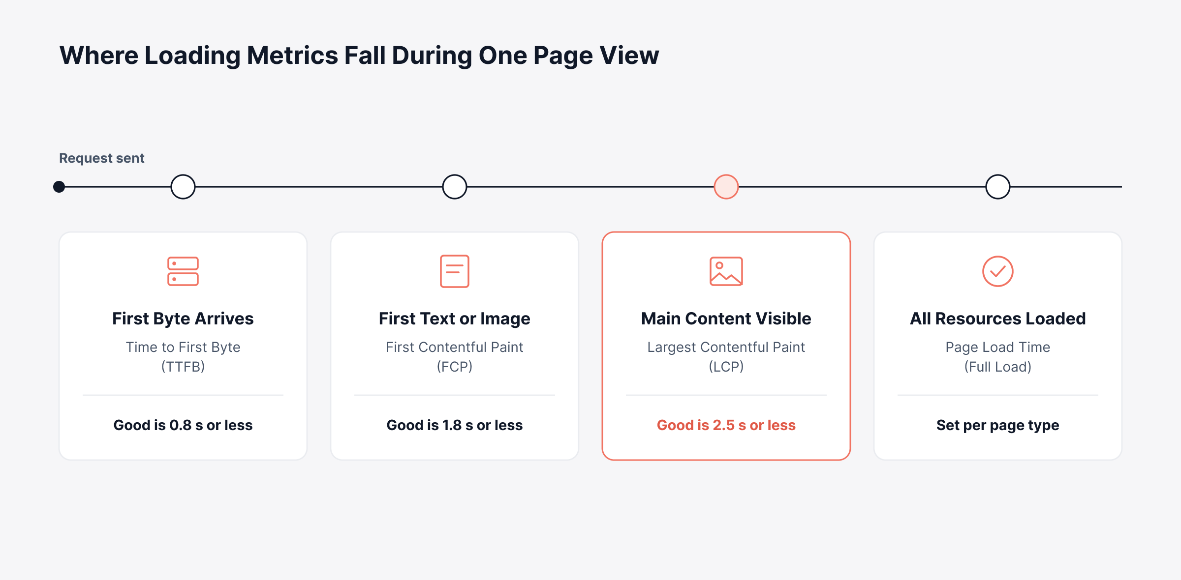
Loading metrics only make sense as a sequence, because a slow early stage delays every stage after it. The timeline below shows where each loading metric falls during a single page view
1. Time to First Byte (TTFB)
TTFB is the time between the browser requesting a page and receiving the first byte of the response.
Good threshold: 0.8 seconds or less; poor above 1.8 seconds
Includes: Redirects, DNS lookup, connection setup, the secure connection handshake and server processing time
A high TTFB points toward the network path or the backend, which makes it the first number to check when every later loading metric looks slow. In practice, it is the network and server latency as the visitor experiences it.
2. First Contentful Paint (FCP)
FCP marks the moment the browser shows the first text or image on screen.
Good threshold: 1.8 seconds or less; poor above 3 seconds
FCP tells the visitor that something is happening, which reduces early abandonment. A large gap between TTFB and FCP usually means stylesheets or scripts are blocking the page from drawing.
3. Largest Contentful Paint (LCP)
LCP marks when the largest image or text block in the visible area finishes rendering, which is usually the content the visitor came for.
Good threshold: 2.5 seconds or less; poor above 4 seconds
Breakdown: LCP splits into TTFB, resource load delay, resource load duration and element render delay
That breakdown is what makes LCP useful for diagnosis. If most of the time is resource load duration, the main image is too heavy; if it is render delay, the image arrived but something blocked it from appearing. Our optimization guide covers the fixes for each case.
4. Page Load Time
Page load time measures how long the browser takes to finish loading every image, script and stylesheet on the page.
Good threshold: No universal standard; set a baseline per page type and watch for change
Page load time helps spot heavy pages, though it also counts third-party scripts, such as analytics tags, that finish loading after the visitor can already use the page. Tracking it next to LCP in page load performance views shows whether a slow load actually delays visible content. Once the content appears, the next question is whether the page reacts when visitors start using it.
Which RUM Metrics Show Whether a Page Responds to Input?
RUM metrics for interactivity measure the delay between a user action and the screen updating in response. A page can load quickly and still seem broken if a button takes half a second to react. On forms and checkouts, that delay often leads to repeated clicks or abandoned tasks.
5. Interaction to Next Paint (INP)
INP measures how long the page takes to visibly respond to clicks, taps and key presses during a visit, and reports one of the slowest responses. A high INP means at least some clicks or taps on the page were slow to show a result.
Good threshold: 200 milliseconds or less; poor above 500 milliseconds
History: Replaced First Input Delay as one of the Core Web Vitals in March 2024
To fix a poor INP, you need to know which part of the interaction took the time. The sequence below splits one slow interaction into its three phases and shows the usual fix for each.
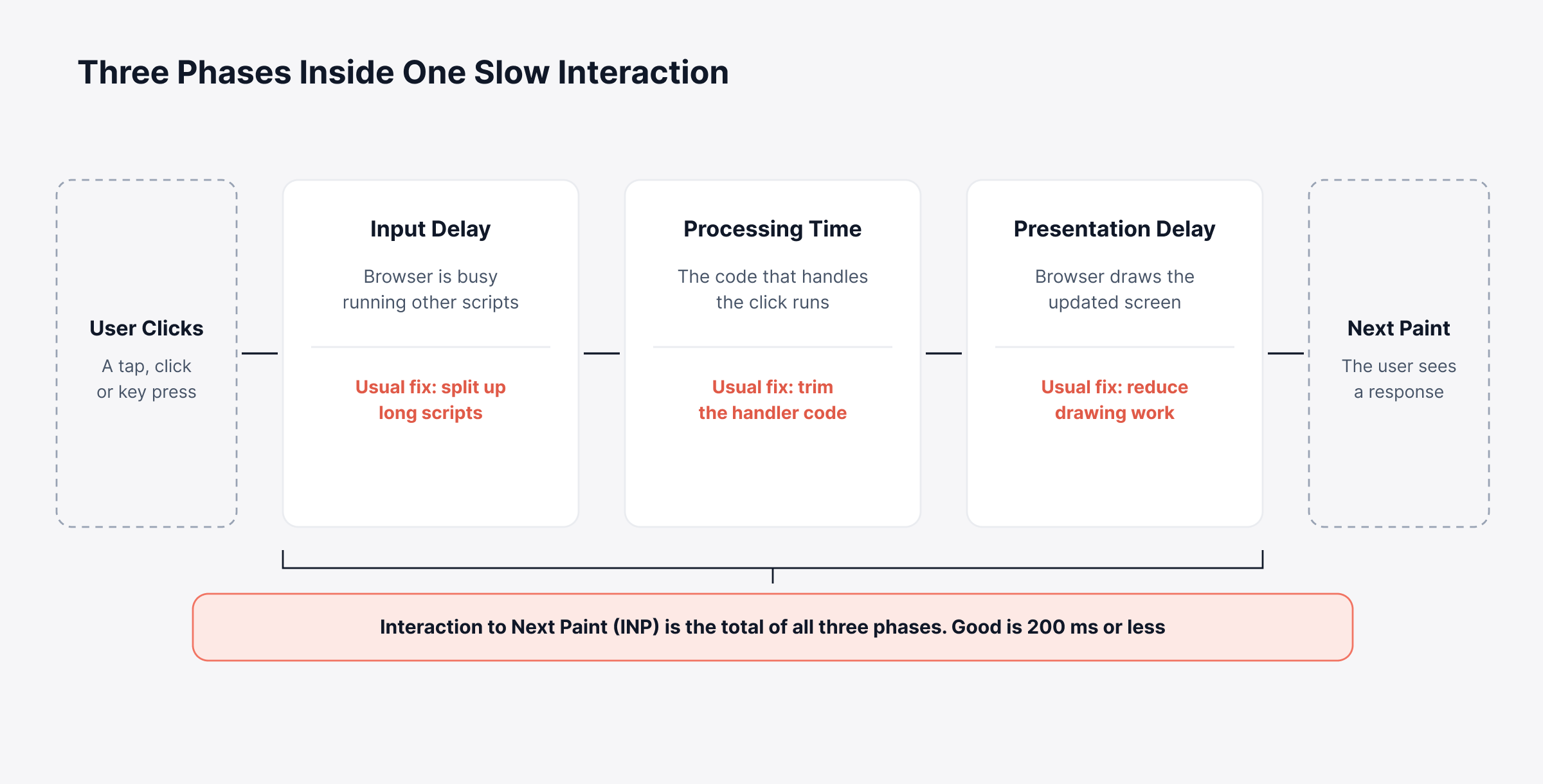
A long input delay means the browser was busy with other scripts when the visitor clicked. Long processing time points at the code that handles the click, and a long presentation delay usually means the browser had a large amount of layout and drawing to finish.
6. Long Tasks on the Main Thread
A long task is any piece of browser work that runs for more than 50 milliseconds without a break, blocking the page from responding to the visitor.
What to track: Count and total duration of long tasks per page view, and the scripts that caused them
Long tasks are the usual reason behind a poor INP, and third-party tags such as chat widgets and ad scripts are frequent sources. Frontend flame charts show which script kept the browser busy and for how long. The next group checks whether the page stays still while it loads.
Which RUM Metrics Show Whether a Layout Stays Stable?
RUM metrics for visual stability measure how much visible content moves unexpectedly while the page is in use. Sudden shifts cause misclicks, such as tapping an ad when the visitor meant to tap a button, and frustrate visitors even when the page loads fast.
7. Cumulative Layout Shift (CLS)
CLS scores the largest burst of unexpected layout movement during a page's lifetime.
How it is scored: Each shift is rated by how much of the screen moved and how far it moved; the worst burst of shifts within a five-second window becomes the CLS value
Good threshold: 0.1 or less; poor above 0.25
Excluded: Shifts within half a second of a user action, since the visitor expected them
Common causes include images without set dimensions, late-loading ads and web fonts that swap after the page appears. Knowing which element moved tells developers what to fix, and web vitals monitoring shows the page and release where each shift happened. Even a fast, stable page can stop working when its code fails, and the error metrics below track those failures.
Which RUM Metrics Show What Broke for Users?
RUM metrics for errors count the failures visitors actually hit in their browsers. Server logs miss many of these, because the failure happens after the server has already returned a successful response, so these metrics are often the first sign that a feature has stopped working for customers.
These metrics feed error analytics that separate new failures from known ones and show how many visitors each one affects.
8. JavaScript Error Rate
JavaScript error rate is the share of sessions or page views that recorded at least one unhandled code failure in the browser.
Formula: Sessions with one or more JavaScript errors divided by total sessions
What to track: New error types after a release, and errors grouped by message, file and browser
A rate is more useful than a raw count, because traffic spikes raise counts without anything getting worse. Grouping errors through JavaScript error tracking keeps a new error visible even when an older, frequent error fills the list.
9. Failed and Slow API Requests
This metric tracks the background requests a page makes to backend services, known as fetch and XHR calls, that return an error, time out or exceed a response-time target.
What to track: Failure percentage and 95th percentile response time per endpoint, split by page
This metric connects frontend and backend health. A rising error rate on one endpoint often explains a broken checkout button long before a backend alert fires.
10. Failed Resource Loads
Failed resource loads record images, scripts, stylesheets and fonts that did not download.
What to track: Failed resources by domain, so failures on your own servers are reported separately from failures at third-party providers
A failed stylesheet from a content delivery network can break a layout for one region only. Replaying an affected visit with session replay shows what that visitor saw. Once you know what broke, the next step is to see how visitors reacted.
Which User Experience Metrics Show How Visitors Behave?
User experience metrics in RUM record what visitors did after the page loaded, and they connect performance to the outcomes the business measures. A change in these metrics does not prove its own cause, so compare each one with a timing or error metric before drawing a conclusion.
Reading them at the session level through journey tracking shows the sequence of pages and actions behind each drop in engagement.
11. Rage Clicks and Dead Clicks
A rage click is a rapid burst of clicks on one element, and a dead click is a click that produces no visible response.
What to track: Pages and elements with the highest rate of either signal
Both usually point at an element that looks clickable but is slow, disabled or broken. They are among the quickest ways to find a problem that no error message reports.
12. Funnel Drop-off and Journey Completion
Funnel drop-off measures the share of visitors who leave at each step of a defined path, such as product page, cart and payment.
What to track: Drop-off per step, split by whether the step met its LCP and INP thresholds
Mapping user journeys against performance shows whether slow steps lose more visitors. A conversion funnel view then shows the conversion rate next to page speed for each step.
13. Custom Timings for Key Actions
Custom timings measure how long a business-critical action takes from the visitor's side, such as search results appearing, a quote being calculated or a payment being confirmed.
What to track: One or two timings per key journey, defined with product owners, using the same percentile targets as standard metrics
Standard metrics measure pages in general, while custom timings measure the specific actions that bring in revenue. They also give business stakeholders a metric they recognize, such as the time it takes to see a quote.
14. Apdex Score
Apdex converts response times into a single satisfaction score between 0 and 1.
Formula: Satisfied count plus half the tolerating count, divided by total samples
Target: 0.94 or higher is conventionally rated excellent; set the threshold time per page type
An Apdex score gives business stakeholders one number to follow. Keep the underlying percentiles in view, since a single score can hide which pages pulled it down.
Why do Percentiles Matter More Than Averages for RUM Metrics?
RUM metrics should be read as percentiles because averages hide the slow experiences that drive complaints and lost sales. Page timings are uneven: most visits are quick, and a small group is very slow.
The percentiles most often used are:
p50 (median): The typical visit; half of page views were faster
p75: The value Google uses to assess Core Web Vitals; three out of four visits were at or below it
p95: The slowest 5% of visits, often from older devices or slow networks
p99: The worst 1% of visits, useful for catching backend timeouts and outliers
Averages can pass a threshold while a meaningful share of visitors waits far longer. The worked example below runs the arithmetic on 100 page views.
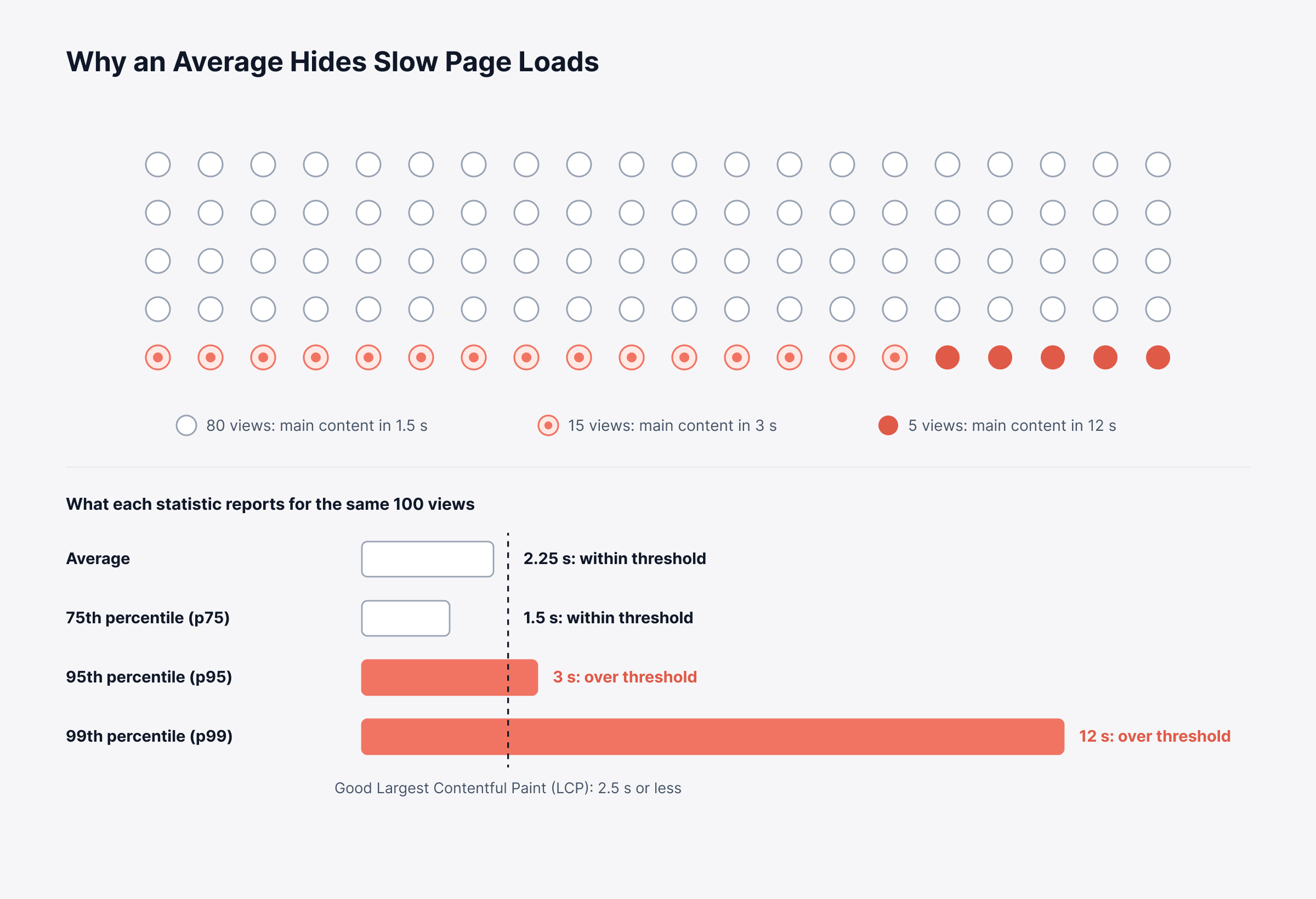
In this hypothetical sample, 80 page views show the main content in 1.5 seconds, 15 take 3 seconds and 5 take 12 seconds. The average is 2.25 seconds and p75 is 1.5 seconds, so both pass. The p95 is 3 seconds and the p99 is 12 seconds, which means one visitor in twenty waits longer than the good threshold and some wait almost five times longer.
Use p75 to judge whether a page meets its target and p95 or p99 latency to find the tail. Percentiles also need enough samples, so treat a page with a few dozen views a day as a trend signal only. Once the statistic is chosen, the next decision is which metrics need an immediate alert and which can wait for a regular review.
Which RUM Metrics Should You Alert On and Which Should You Trend?
RUM metrics that change suddenly and need a fast decision belong in alerts, while metrics that drift slowly belong on trend charts. Alerting on everything produces noise that on-call staff learn to ignore, which raises the risk of missing the alert that matters.
Metric | Alert or Trend | Reason |
JavaScript error rate | Alert | Sudden jumps usually follow a release or third-party change and need a rollback decision |
Failed API request rate | Alert | A failing endpoint blocks visitors from completing tasks right away |
TTFB at p95 | Alert | A rising tail often signals a backend or network problem that will spread |
LCP at p75 on key pages | Alert on a sustained breach, trend otherwise | Short spikes are common; a breach lasting across several windows is not |
INP at p75 | Trend, alert on a step change after a release | Responsiveness degrades gradually as code and tags accumulate |
CLS at p75 | Trend | Layout shifts rarely cause outages but affect conversion over time |
Page load time | Trend | Useful for spotting heavy pages, too noisy for paging anyone |
Rage and dead clicks | Trend | Best reviewed alongside releases to find broken elements |
Three rules keep RUM alerts useful:
Set a minimum sample size: Skip alert evaluation when too few page views arrived in the window
Require a sustained breach: Fire only when the threshold is crossed across consecutive windows
Route to an owner: Send frontend alerts to whoever owns the page, with the release version attached
Trend metrics work best on experience dashboards grouped by page type. Tying frontend targets to error budgets turns a slow drift into planned work before it becomes an incident.
Which RUM Metrics Should Business Leaders Review?
RUM metrics for business leaders should be a short set that ties digital experience to revenue, cost and risk. Engineers use dozens of metrics, but a leadership review works best with around five that inform budget and priority decisions.
A practical leadership view includes:
Good experience rate on key journeys: Share of checkout, sign-up or login page views that met their LCP, INP and CLS targets
Error-affected sessions: Share of sessions in which a visitor hit a code or API failure
Conversion by speed band: Conversion rate for fast sessions compared with slow sessions on the same journey
Experience after each release: Whether key metrics improved or declined after the latest deployment
Regional and device gaps: Markets or device types where experience lags behind the rest
Framing these as service level objectives gives leadership a measurable goal to fund and track. When one of these numbers changes, segmentation shows which pages and visitors caused the change.
How do You Segment Web Performance Metrics to Find Slowdowns?
Web performance metrics become diagnostic when they are split by the conditions that shape them. A single site-wide number shows that something changed, and segmentation shows where and for whom.
The dimensions that explain the most variation are:
Device class: Mobile, tablet and desktop, since processing power drives INP and long tasks
Browser and version: Rendering engines differ, and a new browser release can change results overnight
Connection type: Slow connections stretch TTFB and resource load duration
Geography: Distance from servers and content delivery nodes affects every loading metric
Page type: Product, search and checkout pages have different weights and targets
Release version: Comparing before and after a deployment isolates regressions caused by code
Segmentation also protects against a common misreading. Suppose a marketing campaign brings in many more mobile visitors on slower connections, and site-wide LCP at p75 rises from 2.2 to 2.9 seconds. Splitting by device through RUM segmentation shows every segment unchanged, which means the mix of visitors changed and the latest release did not cause the slowdown.
What Makes RUM Metrics Hard to Read Correctly?
RUM metrics come from visitors' own devices and networks, so the way the data is collected affects what the numbers mean. Checking these details first confirms whether a reported slowdown is a genuine problem before engineering time goes into it.
Single-page application routes: LCP and CLS are measured on the first page load, and route changes in React, Angular, Vue or Next.js applications need framework support to be timed as their own views
Background tabs and restored pages: Pages opened in a background tab or restored from the browser cache report very different timings and should be separated or excluded
Cross-origin scripts: Errors from scripts hosted on another domain appear as a generic "Script error" unless those scripts are served with the right cross-origin settings
Browser coverage: Some metrics are reported only by certain browsers, so compare segments that report the same metric
Sampling and privacy controls: Sampling rates and consent settings reduce the data available, and masking settings affect what session replay shows
Mobile apps: Native mobile apps use their own measures, such as app start time and crash-free sessions, so keep them separate from web metrics
Filtering or labeling these cases on the dashboard stops unlike data from being mixed in one chart. With clean data in place, the next step is to trace a slow page to its cause.
How do You Connect RUM Metrics to Backend Causes?
RUM metrics show what visitors experienced, and connecting them to backend data shows why. Most slow pages trace back to a slow API, a database query or a third-party service, so the quickest route to a fix is to follow one slow session from the browser to the backend.
A hypothetical example shows the path. LCP at p75 on product pages rises after a release, but only in one region. Segmentation isolates pages that call the catalog API, response time for that call has doubled, and the linked backend trace shows the API waiting on one slow database query.
That path depends on three connections:
Trace correlation: Each page view carries a trace ID, so backend traces open directly from a slow session
Resource-level timing: Flame charts show which request, script or rendering step consumed the time
Session context: Replay and journey data show what the visitor was doing when the slow request fired
When all three are in one platform, frontend and backend owners review the same evidence together, which shortens the time from complaint to fix. Our guide to application performance monitoring covers the backend side in more detail.
Go From Slow-Page Complaints to Clear Root Causes with Motadata ObserveOps
RUM metrics are most useful when each number answers a clear question and links to the data that explains it. Grouping metrics by loading, interactivity, stability, errors and engagement, reading them as percentiles and reporting a short set to leadership gives every page owner a short, clear list of what to fix.
One limit applies to every RUM tool: it only measures visitors who arrive and whose browsers run the script. Pages without traffic, flows not yet released and quiet overnight periods still need scheduled synthetic tests to measure them.
Motadata RUM in ObserveOps brings user experience into full-stack observability:
Frontend coverage: Core Web Vitals, JavaScript errors, sessions and user journeys across browsers, devices and regions
Backend context: Correlation of RUM data with traces, logs and infrastructure metrics
Shared view: Dashboards and alert policies that page owners, operations staff and business leaders read from the same data
Frontend symptoms and their backend causes appear in one place, so the time between a bad number and a fix gets shorter.
Author
Poonam Lalani
Content Strategist
Poonam Lalani is a B2B content strategist and writer with a background in computer engineering and experience across enterprise technology domains, including AI, cloud, DevOps, data engineering, and IT operations. She specializes in creating research-driven content that simplifies complex ideas and supports product education, thought leadership, and business growth.