Top 10 Digital Experience Monitoring Tools in 2026
Server dashboards can look healthy while users wait. Only 51% of the 1,000 most popular mobile sites pass Core Web Vitals, according to the HTTP Archive's 2025 Web Almanac.
Closing that gap is the job of digital experience monitoring tools. Some watch customers on your website and mobile apps, others watch staff on laptops and virtual desktops, and a third watches the network in between.
Pick the wrong type and you lose a review cycle. The 10 below are grouped by the job they do, so you can settle the category first and the product second.
What Is Digital Experience Monitoring?
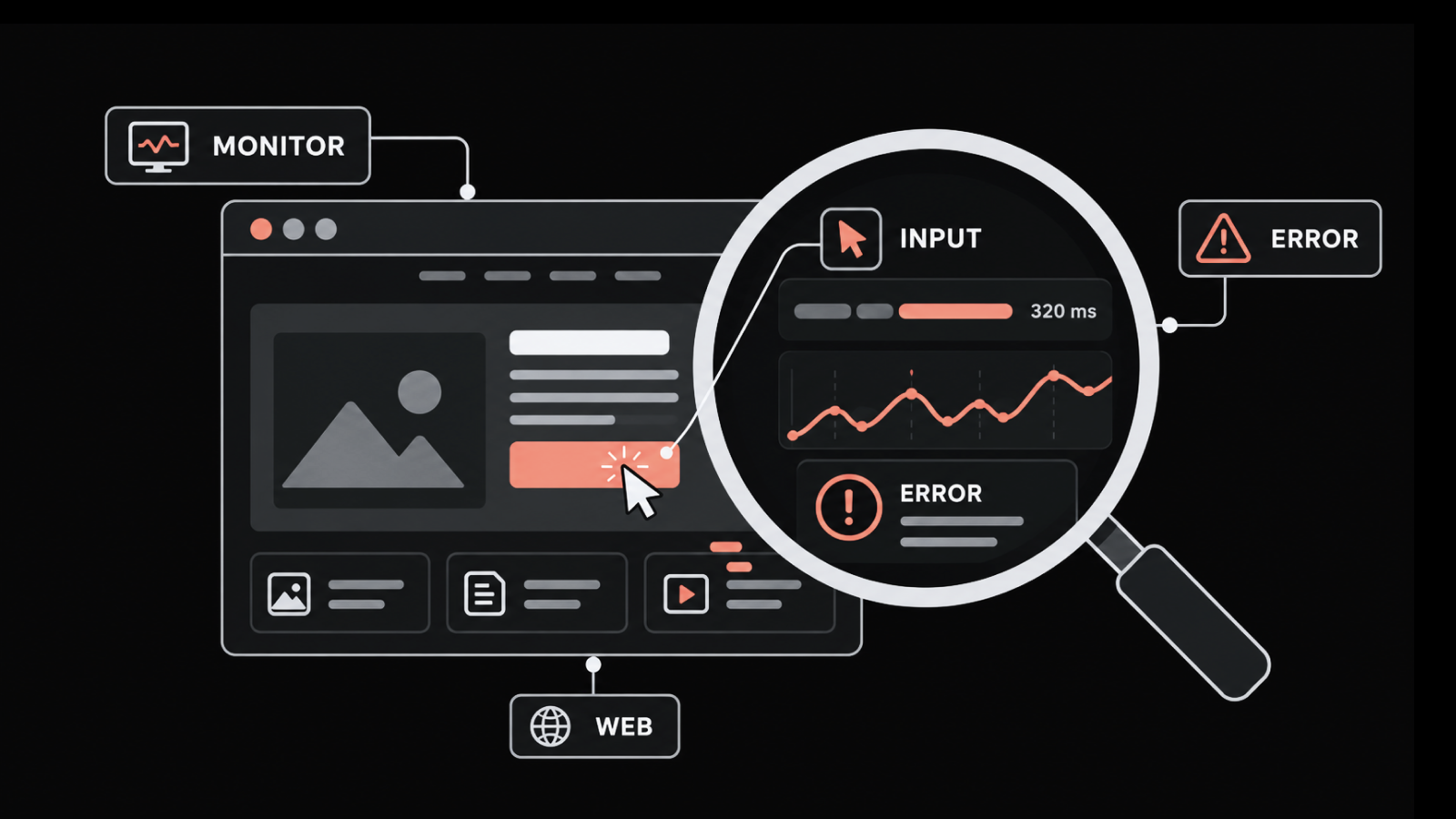
Digital experience monitoring measures how people actually experience your apps. It tracks page load times, client-side errors, session behavior, device health, and network path quality.
Those signals then link back to the systems underneath. That link is what separates DEM from application performance monitoring, which starts inside the app and works outward.
What Are the Three Types of DEM Tools?
DEM tools split into three groups. The group you need is set by which users are complaining, so settle that before comparing features.
Customer experience DEM: Watches how outside users experience your websites and mobile apps. It uses real user monitoring, synthetic checks, and session replay. Motadata ObserveOps, Dynatrace, Datadog, New Relic, and SolarWinds sit here.
Network and internet DEM: Watches the path between users and apps, covering ISP routing, DNS, CDN, VPN, and SaaS links. Cisco ThousandEyes and Catchpoint lead this group.
Digital employee experience (DEX): Watches how staff experience their own devices and work apps, through agents on laptops and virtual desktops. Nexthink, Lakeside SysTrack, and Riverbed Aternity anchor this group.
Gartner defines DEM as covering inside users, outside users, and API consumers alike. Most vendors serve one group well. We regularly see shortlists drawn from a single group fall apart partway through a trial.
How We Picked These DEM Tools
We built this list from four inputs, not vendor marketing pages. Verified reviews on Gartner Peer Insights came first, weighted by review count inside the DEM market.
Search and answer-engine consensus came second, covering the tools Google and the major AI assistants name again and again. Category coverage came third, because a list weighted to one group misleads more than it helps. Practical fit came last.
Every tool was then scored against the same criteria:
Who it watches: Customers, staff, or both.
Monitoring types: Whether RUM, synthetic, session replay, and endpoint checks are bundled or sold apart.
Correlation depth: How fast you get from a frontend symptom to the backend cause.
Deployment options: SaaS, self-managed, on-premises, or all three.
Pricing clarity: Whether you can model next quarter's bill from this quarter's session volume.
Ratings below are current at the time of writing, and they move with new reviews.
The Top 10 DEM Tools Compared
The table sorts the field by who each tool is built to watch. That column rules out options faster than any other.
Tool | Watches | Best For | Monitoring Types | Deployment | Pricing Model |
1. Motadata ObserveOps | Customers | Customer experience plus infrastructure in one platform | RUM, session replay, service checks, APM, network, logs | On-premises, private cloud, public cloud | Quote-based |
2. Dynatrace | Customers | Automated root cause in large hybrid estates | RUM, synthetic, session replay, mobile | SaaS, managed, on-premises | Usage-based |
3. Datadog | Customers | Teams already running Datadog | RUM, synthetic, session replay, mobile | SaaS only | Modular SKU |
4. New Relic | Customers | Frontend data tied to backend traces | RUM, synthetic, session replay, mobile | SaaS only | Usage-based on data ingest |
5. Cisco ThousandEyes | Both | Proving whether the fault is yours or the ISP's | Synthetic, endpoint, network path, BGP | SaaS with agents | Agent and test-based |
6. Catchpoint | Both | Global synthetic reach across ISP, CDN, and DNS | Synthetic, RUM, network, endpoint | SaaS with agents | Custom enterprise |
7. SolarWinds Observability | Customers | Mid-market teams on a fixed budget | RUM, synthetic, uptime, APM | SaaS and self-hosted | Subscription tiers |
8. Nexthink | Employees | Staff device and work app experience | Endpoint, sentiment, remediation | SaaS with agents | Quote-based per device |
9. Lakeside SysTrack | Employees | Deep endpoint data across large fleets | Endpoint, virtual desktop | SaaS and on-premises | Quote-based per device |
10. Riverbed Aternity | Both | Endpoint and VDI experience plus customer journeys | Endpoint, VDI, RUM | SaaS and on-premises | Quote-based per device |
Six of these tools watch customers. Three watch staff, and three cover both. Only ThousandEyes, Catchpoint, and Aternity span the divide, which is why we see so many teams running two DEM tools instead of one.
Detailed Overview of the Top Digital Experience Monitoring Tools in 2026
The list starts with platforms that join experience data to the infrastructure under it. It then moves to network path tools, and finishes with staff experience tools.
1. Motadata ObserveOps
Rating: G2 4.7/5, Gartner Peer Insights 4.6/5
Best for: IT and NOC teams that want customer experience data beside their app, network, and infrastructure monitoring. It suits hybrid and on-premises estates best.
Pricing: Quote-based, with a free 30-day trial.
Motadata ObserveOps is our unified observability platform. Digital experience monitoring runs across three of its modules rather than shipping as a separate product.
Real user monitoring handles the browser side, scoring what users feel on every page. Session data slices by device, browser, and region, so a regional slowdown shows up as a pattern rather than a stray complaint.
Application performance monitoring covers the other half of the trace. It follows the request behind a slow page down to the method that caused it.
URL monitoring then fills the quiet hours. Scheduled checks catch an outage at 3 a.m. when no real user is around to report it.
Most experience problems are not frontend problems. A slow page tells you something is wrong. Then somebody opens a second tool to find out whether the API, the database, or a network path caused it. Keeping all three signals in one place removes that handoff, and the DFIT engine correlates them instead of leaving you to do it.
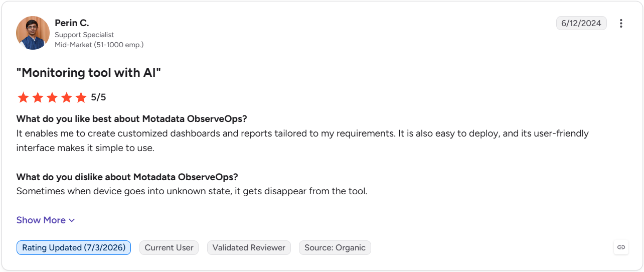 Here is what one of our customers, Perin C. had to say about ObserveOps on G2.
Read more of our G2 reviews here.
Pros
- Frontend data, traces, logs, network, and infrastructure sit in one platform. That removes the tool-switching that slows incident response.
- On-premises, private cloud, and public cloud modes suit BFSI, government, and telecom estates. Session data never has to leave the environment.
- Apdex scoring and severity thresholds ship configured, so experience reporting works without building it first.
Cons
- Synthetic checks cover URL uptime and response time, not scripted multi-step journeys. Simulating a full checkout flow sits outside its scope.
- Frontend instrumentation covers VueJS, Angular, ReactJS, and NextJS. Teams on other frameworks should check fit before committing.
- There is no staff device experience module. That makes this a customer-facing DEM tool, not a DEX platform.
- Pricing is quote-based, so sizing it takes a sales call.
Watching that correlation run on a real session is faster than reading about it.
2. Dynatrace
Rating: Gartner Peer Insights 4.6/5
Best for: Large firms running complex spread-out estates. It suits teams that want automated root cause over manual digging.
Pricing: Usage-based against a published rate card, with a free trial.
Dynatrace is the most-reviewed product in the Gartner DEM market by a wide margin. Its experience module sits on top of a full observability platform, which is where the value shows up at scale.
The pitch is less digging. Its AI engine decides which of the forty things that changed actually caused the incident. Dependency maps also stay current without anyone maintaining them by hand.
We often see teams weigh it against a unified platform on cost grounds, and Motadata vs Dynatrace is where that comparison usually starts.
Pros
- The strongest automated root cause analysis here, which cuts digging time on large estates.
- Auto-discovery keeps dependency maps current as the estate changes.
- Coverage runs from browser session down to infrastructure in one platform.
Cons
- Enterprise pricing and platform depth are more than most mid-market teams need.
- Usage-based billing across several meters makes forecasting hard.
- The learning curve on custom dashboards and query language is real for new teams.
3. Datadog
Rating: Gartner Peer Insights 4.4/5
Best for: Teams already sending infrastructure or app data to Datadog who want to add frontend coverage.
Pricing: Modular SKU pricing, billed apart for RUM, Synthetics, and Session Replay, with a free trial.
Datadog is the path of least resistance for teams already on the platform. Adding DEM means turning on another SKU and dropping a script onto the frontend, with no new vendor to onboard.
Its integration library is the widest in this list. That matters when your frontend leans on a long tail of third-party services, because each one becomes a place your page can slow down.
Pros
- Fast to deploy when Datadog is already in the stack.
- The largest integration set here, covering most third-party services out of the box.
- Frontend sessions link cleanly to backend traces inside the platform.
Cons
- SKU-based pricing gets messy and costly as you turn on more monitoring types.
- Session and test volume drive cost in ways that are hard to predict up front.
- SaaS only, which rules it out where session data cannot leave your estate.
4. New Relic
Rating: Gartner Peer Insights 4.5/5
Best for: Engineering and DevOps teams that want frontend and backend data in one query interface, with a bill they can forecast.
Pricing: Usage-based on data ingest, with 100 GB per month free and no per-host overage.
New Relic runs DEM as part of one telemetry platform rather than as a bolt-on module. Browser, mobile, synthetic, APM, tracing, and logs all report into the same place.
The billing model is what separates it from the rest of this group. You forecast against one number instead of a stack of per-feature meters, which suits teams with steady traffic and predictable session volumes.
Pros
- Ingest-based pricing with a large free tier is easier to forecast than modular SKUs.
- Frontend symptoms and backend causes sit in the same query language.
- The free tier makes a trial cheap before you commit.
Cons
- Costs scale with data volume, so heavy RUM and session replay need sampling discipline.
- Teams that want only DEM will pay for platform they do not use.
- SaaS only, with no on-premises option for regulated estates.
5. Cisco ThousandEyes
Rating: Gartner Peer Insights 4.8/5
Best for: Teams that need to prove whether a slowdown sits in their app, their network, the ISP, or a SaaS provider.
Pricing: Agent and test-based, quoted through Cisco.
ThousandEyes carries the highest rating in the Gartner DEM market, and it answers a question app-layer tools cannot. It measures the segments you do not own, which is where a surprising share of user-facing slowdowns actually start.
It also reaches into end user network experience monitoring through agents on staff machines. That mix is why it spans both halves of the category.
Pros
- Visibility into infrastructure you do not own, which ends most finger-pointing between teams and providers.
- Covers staff and customer experience through separate agent types.
- The highest-rated product in the Gartner DEM market.
Cons
- No app-layer coverage, so it does not replace RUM, session replay, or APM.
- Pricing scales with agents and test volume, which adds up fast across many sites.
- Full value assumes a network team that can act on path-level data.
6. Catchpoint
Rating: Gartner Peer Insights 4.5/5
Best for: Firms delivering digital services worldwide, where CDN, DNS, and last-mile ISP speed shape the experience.
Pricing: Custom enterprise pricing.
Catchpoint runs one of the largest synthetic footprints in the industry, and the placement matters more than the count. Its vantage points sit inside ISP and last-mile networks, not only in cloud data centers.
That reach shows up when your users are spread out. A CDN can behave very differently in Jakarta than it does in Frankfurt, and testing from a nearby cloud region will never surface the gap.
Pros
- The deepest synthetic and internet-layer view available, mainly for CDN and DNS troubleshooting.
- Vantage point coverage reaches networks other vendors cannot.
- Covers both customer and staff experience.
Cons
- More focused on synthetic and network checks than unified observability, so it often runs beside an APM tool.
- Enterprise-only pricing with no public entry point makes it hard to judge at smaller scale.
- A large test estate takes real effort to set up and maintain.
The two tools above answer network questions well, and neither one sees inside your application. Running both halves in one console is the part worth watching before you commit.
7. SolarWinds Observability
Rating: Gartner Peer Insights 4.1/5
Best for: Mid-market teams that want RUM, synthetic, and uptime checks without enterprise licensing.
Pricing: Subscription tiers across SaaS and self-hosted, with free trials.
SolarWinds Observability extends the company's long-running monitoring line into full-stack coverage, with Pingdom beside it for uptime and synthetic monitoring. Together they cover the DEM basics at a price the enterprise platforms here do not reach.
What you give up is depth. This is competent, low-cost experience monitoring, and it will not map your whole dependency graph. Motadata vs SolarWinds shows where that ceiling sits.
Pros
- The lowest entry price here, which makes DEM viable for teams that cannot fund an enterprise platform.
- Self-hosted options suit teams with data residency rules.
- Familiar to the large base already running SolarWinds network tools.
Cons
- The lowest Gartner rating among the products here, with reviewers citing sprawl across the SolarWinds range.
- Less depth in AI-driven correlation and root cause than Dynatrace or New Relic.
- Coverage is split across separate products, so a full picture may need more than one subscription.
8. Nexthink
Rating: N/A in the Gartner DEM market. Listed under Digital Employee Experience Management Tools.
Best for: IT teams responsible for staff productivity across laptops, virtual desktops, and work apps.
Pricing: Quote-based, licensed per device.
Nexthink is the reference product for digital employee experience, and it starts from a different place than every customer-facing tool above. The unit of measurement is the device, not the page.
What sets it apart from plain monitoring is what happens next. A known problem found across a fleet can be fixed by pushing a script. Detection and repair sit in the same tool, not on either side of a ticket queue.
Pros
- The strongest staff experience coverage available, with sentiment data no infrastructure tool captures.
- Automated remediation turns detection into a fix without a ticket cycle.
- Built for spread-out and hybrid workforces.
Cons
- No customer-facing coverage, so it does not watch your website or mobile app at all.
- Per-device licensing gets costly across large fleets.
- Agent rollout and tuning take real effort before value appears.
9. Lakeside Software SysTrack
Rating: N/A in the Gartner DEM market. Listed under Digital Employee Experience Management Tools.
Best for: Large firms that want deep endpoint data and automated root cause across big device fleets.
Pricing: Quote-based, licensed per device.
SysTrack collects a very wide set of endpoint data points at short intervals. That depth supports work other DEX tools cannot reach, including workspace right-sizing and virtual desktop capacity planning.
Teams often choose it over Nexthink when the priority is raw depth and planning rather than sentiment and workflow. It answers questions about the whole fleet, which a single incident would never surface.
Pros
- The deepest endpoint dataset in the DEX group, which supports planning as well as troubleshooting.
- Strong virtual desktop coverage for Citrix and similar estates.
- Runs on-premises for teams that cannot ship endpoint data to a vendor cloud.
Cons
- The data volume creates its own workload, and teams need clear questions to get value from it.
- No customer-facing monitoring, so it covers only half the category.
- Interface and reporting feel dated next to newer DEX platforms.
10. Riverbed Aternity
Rating: Gartner Peer Insights 4.5/5
Best for: Teams that want endpoint and virtual desktop coverage beside customer journey data from one vendor.
Pricing: Quote-based, licensed per device.
Aternity is a DEX product that also carries a customer experience line. That makes it one of the few tools here that really spans both halves of the category.
Its standout measure is app speed timed on the user's device rather than on the server. Problems that look healthy in backend data show up here, because the clock starts where the person is sitting.
Pros
- Covers staff and customer experience under one vendor and one contract.
- Device-side measurement catches problems that server-side checks report as healthy.
- On-premises deployment available for regulated estates.
Cons
- Neither half runs as deep as the specialists, so it trades peak depth for breadth.
- Per-device licensing plus separate customer experience licensing makes budgeting harder.
- Range changes at Riverbed have left some product overlap and naming confusion.
How Do You Choose the Right DEM Tool for Your Team?
Start by deciding who you are monitoring. That single answer removes most of this list at once. In our experience the request arrives framed as a tool question, when it is really a question about which users are complaining.
Once the category is settled, these criteria separate the products inside it:
Monitoring types: Check whether RUM, synthetic, session replay, and endpoint checks are bundled or sold apart.
Synthetic depth: Confirm whether the tool runs uptime checks or scripted multi-step journeys. The gap between RUM vs synthetic monitoring catches teams out during trials.
Backend correlation: Test whether a frontend symptom links to traces, logs, and host metrics without manual work.
Privacy and data residency: For session replay, look for input masking, sampling controls, and deployment modes that meet your rules.
Pricing mechanics: Model the bill as session volume and test counts grow. Usage-based DEM pricing climbs faster than most teams expect.
The table below maps common cases to a starting point.
Your Situation | Start With | Why |
You want customer experience data joined to infrastructure and network monitoring | Motadata ObserveOps | RUM, APM, network, and logs correlate in one platform, with on-premises available |
You run a large spread-out estate and want automated root cause | Dynatrace | Auto dependency mapping cuts digging time at scale |
You already send infrastructure data to one observability vendor | That vendor's DEM add-on | Fastest rollout, no new vendor to onboard |
Users blame the app but you suspect the network or ISP | Cisco ThousandEyes | Hop-by-hop view of infrastructure you do not own |
Your users are global and CDN or DNS speed varies by region | Catchpoint | Vantage points inside ISP and last-mile networks |
Your budget rules out enterprise platforms | SolarWinds Observability | Covers RUM, synthetic, and uptime at a lower entry price |
Staff complain about laptops, VDI, and work apps | Nexthink or Lakeside SysTrack | Endpoint agents measure device-side experience directly |
You need staff and customer experience from one vendor | Riverbed Aternity | One contract covering both halves of the category |
Whichever row fits, shortlist two tools and run them against real traffic for two to four weeks. That window catches a deploy and at least one real incident.
The test we would run first is simple: time how long each tool takes to get from a user complaint to a named cause.
That number is worth more than any feature list. In Uptime Institute's 2026 outage analysis, 57% of operators said their most recent major outage cost more than $100,000. Every minute spent guessing at the cause sits inside that number.
One more check before you commit. If your shortlist holds three tools that all watch the same group of users, you have compared products without comparing categories. That trial will not tell you much.
Scoring your own traffic is the fastest way to find out which category you actually need.
Pick the Right DEM Tool for Your Business
Choosing between digital experience monitoring tools comes down to one question. Are you watching customers, staff, or the path between your users and your apps?
Teams watching staff devices are well served by Nexthink, SysTrack, or Aternity, and no customer-facing platform here will replace them. Teams chasing network and internet problems will get further with ThousandEyes or Catchpoint.
For customer-facing apps, the deciding factor is usually simpler. Does experience data sit beside the traces, logs, and network flow that explain it? That is really a full-stack observability question. Closing that gap is what we built Motadata ObserveOps to do. The on-premises option covers estates that cannot send session data to a vendor cloud.
Get the category right and the payoff compounds. You reconcile fewer tools during an incident, and the path from a user complaint to a fix gets shorter every quarter.
FAQs
What is the difference between digital experience monitoring and APM?
APM measures what happens inside your apps, covering traces, latency, errors, and dependencies. DEM measures what users experience on the other side of the screen. That includes browser rendering, device conditions, and network paths APM never sees.
What is the difference between DEM and DEX?
DEM is the broad category covering how any user experiences a digital service. DEX is the subset focused on staff and their devices. Every DEX tool is a DEM tool, though most DEM tools are not DEX tools.
Do you still need synthetic monitoring if you already have real user monitoring?
Yes, in most cases. RUM only reports problems after a real user hits them, and it goes quiet during low-traffic hours. Synthetic checks run on a schedule, catching outages and regressions before customers meet them.
How long does it take to deploy a digital experience monitoring tool?
Browser-based RUM usually takes hours, since it needs a script on your pages. Endpoint DEX tools take weeks or months. Agents have to be packaged, tested, and rolled out across the whole device fleet.
Can one tool monitor both customer and employee digital experience?
Few do it well. ThousandEyes, Catchpoint, and Aternity span both, though each leans one way. ObserveOps covers customer-facing experience and ties it to infrastructure, so most teams pair it with a DEX tool for staff devices.
Author
Ramya Shah
Technical Writer
Ramya Shah is a technical content writer with a computer engineering background and roots in automotive journalism. He covers IT Service Management, observability, IT operations, and AI-driven automation. An early adopter of AI-assisted writing workflows, he turns complex IT processes into clear, engaging content optimized for search and answer engines (AEO), lifting content output and organic visibility.