All Features
Application Performance Monitoring
APM Flame Chart
The APM Flame Chart in Motadata ObserveOps shades response time and error rate by severity, so degrading services stand out at a glance. No extra setup needed.
What Is the APM Flame Chart?
Application Performance Monitoring produces a large volume of counters across every service and endpoint. Reading those counters one grid row at a time makes it hard to see where application behavior is degrading and how urgent the problem is. The Flame Chart in Motadata ObserveOps, a severity-based heatmap over APM counters, answers that by turning raw counters into a colored picture of how your application code is performing.
The Flame Chart is a dashboard widget. From the platform's widget catalog, it reads the two counters the APM module already records for every instrumented service: response time and error rate. Each cell is shaded by severity, so a wall of numbers becomes a field of color where the worst areas stand out immediately, and the widget sits on the same dashboard canvas as the rest of your platform widgets.
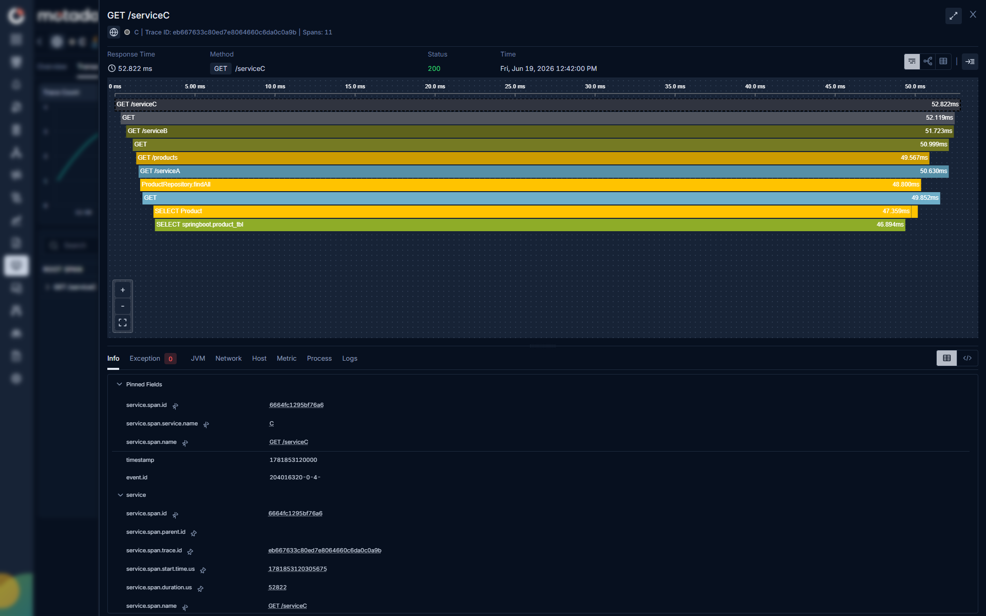
Because the Flame Chart is built on counters APM already collects through a single unified MotaAgent on OpenTelemetry standards, it needs no additional telemetry configuration. If your services are instrumented, the data is available. The same widget also reads browser-side counters, Largest Contentful Paint and First Contentful Paint, from the Real User Monitoring module when it is active, so frontend and application-side teams read severity the same way.
This capability reads application performance only. On the APM side, Flame Chart cells reflect backend service counters; Largest Contentful Paint and First Contentful Paint are browser paint timings owned by RUM, and host CPU, memory, and Kubernetes node health are a Hybrid Infrastructure concern.
Key Features of the APM Flame Chart
1. APM counter coverage:
The Flame Chart renders the APM module's response time and error rate together, so the latency and reliability dimensions of application performance sit in one view instead of separate grids.
2. Severity-based visual assessment:
Each cell is shaded by severity rather than shown as a bare figure, so the eye is drawn to the areas that need attention first without reading every value.
3. Built on existing APM counters:
The visualization reuses counters the APM module already records. There is no new pipeline to stand up and no additional telemetry setup to complete before the Flame Chart becomes useful.
4. Real-time performance picture:
The Flame Chart reflects current counter values, so the severity view keeps pace with how the application is behaving now rather than showing only a historical snapshot.
5. A dashboard widget, not another console:
The Flame Chart lives in the platform's dashboard widget catalog, so an APM severity view composes with the gauges, charts, and alert widgets a team already runs on one canvas.
6. RUM counters co-available in the same widget:
With the Real User Monitoring module active, the same widget reads Largest Contentful Paint and First Contentful Paint from the browser side. Application and frontend teams share one visual language for severity while each module keeps its own counters.
7. Single unified MotaAgent collection:
A single unified MotaAgent instruments application services across APM's eight supported languages, so the counters the Flame Chart displays come from the same consistent source as every other APM view.
8. Coverage that includes code-free services:
Services instrumented through the code-free eBPF/OBI path capture latency and error rate without an agent install, and those readings surface in the same APM data the Flame Chart draws from, extending baseline severity visibility even before deeper instrumentation is configured.
How the Motadata ObserveOps APM Flame Chart Works
1. Data Collection
The single unified MotaAgent instruments your application services across Java, .NET, PHP, Node.js, Python, and Go on Host/VM, Docker, and Kubernetes, and records the counters the Flame Chart uses: response time and error rate.
For C++ and Ruby, the same counters are instrumented on Host/VM and Docker.
No additional telemetry configuration is required beyond the instrumentation already in place, since the Flame Chart reuses these existing counters, and eBPF/OBI-discovered services contribute baseline latency and error rate readings without any agent install.
2. Data Analysis
Counter values are assessed against severity levels so each measurement is classified by how far it sits from acceptable performance. This is what lets the visualization express application state as graded severity rather than a flat list of numbers.
3. Visualization
The graded counters are laid out as a severity heatmap widget on a dashboard, with each cell shaded by severity. The result is a real-time, color-driven view of application performance that reads at a glance. The same widget reads RUM's browser-side counters for teams working the frontend side, with each module's counters gated by its own license: APM counters need the APM module, and RUM counters need the RUM module.
Deployment and Environment Coverage
The Flame Chart follows APM wherever it is instrumented. For Java, .NET, PHP, Node.js, Python, and Go, the underlying counters are collected on Host/VM, Docker, and Kubernetes, including managed distributions on AWS EKS, Oracle OKE, Google GKE, and Rancher, plus serverless AWS EKS Fargate.
For C++ and Ruby, Flame Chart counters are collected on Host/VM and Docker.
Because the same single unified MotaAgent and OpenTelemetry foundation stand behind every environment, a service running on a virtual machine, in a container, or in a cloud-native cluster shows up in the Flame Chart the same way, giving cloud and on-premises estates one consistent severity view rather than a separate dashboard per environment.
Benefits of the APM Flame Chart with Motadata ObserveOps
1. Spot degradation faster
Severity shading surfaces the worst-performing areas at a glance, so investigation starts where it matters instead of scanning long counter tables.
2. No extra setup cost
Because the Flame Chart draws on counters APM already collects, teams get the view without configuring new telemetry or changing how services are instrumented.
3. Latency and reliability in one read
Seeing response time and error rate together makes it easier to tell whether a degrading area is a latency problem, an error problem, or both.
4. Shared language with frontend teams
With RUM's counters co-available in the same widget, application and browser-side teams describe severity the same way, which shortens handoffs between the two.
5. Focus on application behavior
The APM Flame Chart stays within backend service counters, cross-linking to Hybrid Infrastructure and RUM rather than reporting on either layer directly.
6. One canvas for severity
Because the Flame Chart is a dashboard widget, an APM severity read sits beside the availability, alert, and metric widgets a team already watches instead of in a separate console.
How the APM Flame Chart Fits Alongside Infrastructure Monitoring and RUM
On the APM side, the Flame Chart's counters, response time and error rate, describe application code behavior. The browser's side of the story, Largest Contentful Paint and First Contentful Paint, belongs to Real User Monitoring, which contributes those counters to the same widget from its own data collection. Neither reading substitutes for infrastructure health: host CPU, memory, and Kubernetes node health are read through the Hybrid Infrastructure module, which supplies its own severity context for the layer underneath.
ObserveOps keeps the three views distinct while linking them at the edges, so a red Flame Chart cell over an APM counter can be checked against RUM's browser-side reading in the same widget and against Hybrid Infrastructure's view of the host it runs on, without any one module claiming the others' signal as its own.
Conclusion
The Flame Chart gives Motadata ObserveOps a fast way to read application performance without wading through counter grids. By shading the APM module's response time and error rate by severity, building on counters already collected through a single unified MotaAgent, and living on the same dashboard canvas as the rest of the platform's widgets, it turns routine monitoring data into an immediate picture of where application code needs attention. With RUM's browser-side counters co-available in the same widget, teams across the application and frontend keep a shared sense of what is healthy and what is not.
Ready to implement APM Flame Chart?
Discover how Motadata ObserveOps can help you monitor your infrastructure in real-time and respond to issues instantly.